| Benjamin Wilkins - A2 Media Studies |
|
FILM POSTER
Below are the stages of our poster production, describing the actions, alterations and development we decided to take. Additionally, the effects we decided to use on Photoshop and the codes and conventions used.
PRODUCTION OF OUR FILM POSTER
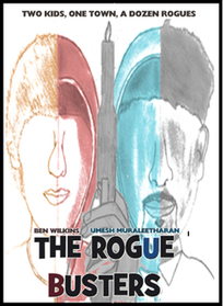
STAGE 1
|
STAGE 2
|
|
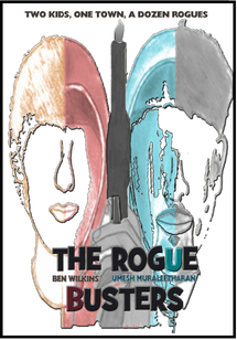
STAGE 3
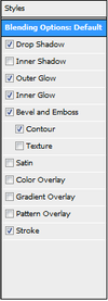
I changed the blending options on the foreground image. I decided to make the image have a drop shadow, outer glow, inner glow, bevel and emboss, contour & a stroke. I wanted to style to foreground image with shadows and glows to make the image appear dominant and highlighted on the poster. The outcome of the editing is above.
|
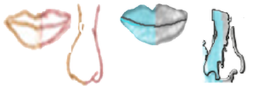
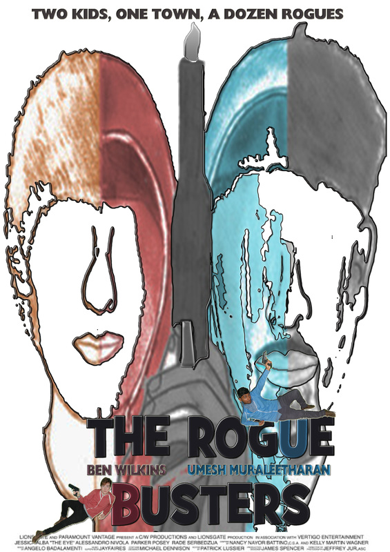
We liked the idea of making the main features of the characters face extremely noticable. We used the magic wand and rubber to remove any shading and colouring away from the main features. We then cut the features out and pasted them in indivdual layers, allowing us to indivdually edit them. I altered the image by styling it with a drop shadow, outer glow and stroke.
These photo's were taken by myself, I then edited them by removing the background using the magic wand on Photoshop I then positioned the 2 images around the title. We also decided to add a billboard, and positioned it at the bottom of the poster, this is a common element of a poster.
|
FILM MAGAZINE
Below are the stages of our magazine production, describing the actions, alterations and development we decided to take. Additionally, the effects we decided to use on Photoshop, the codes and conventions used and the main image we decided to use.
A SELECTION OF PHOTOS FOR OUR MAGAZINE
|
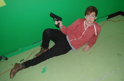
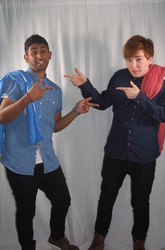
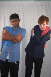
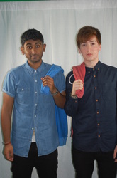
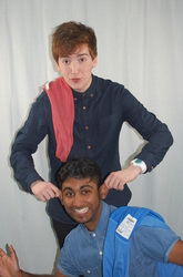
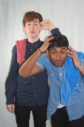
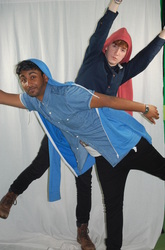
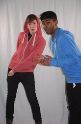
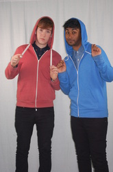
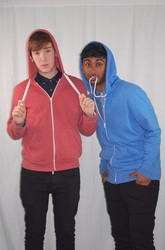
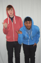
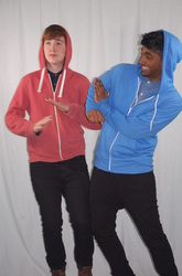
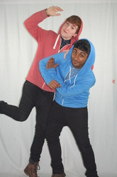
For one lesson, we decided to take a selection of photographs for our magazine. We took a lot of photos to allow us to experiment and see what works well with the style and layout of our magazine. Jai took the photos of Ben and Umesh, the main characters in our film, he directed us, positioning us in certain ways, poses, expressions, etc. he wanted us to fit the character, as he was taking photos of us being the characters in the film. After this, he decided to take photos of the actors, having a laugh, which is a typical photo look in the Entertainment Weekly Magazine.
Below are the photo's he took: |

MAIN IMAGE
|
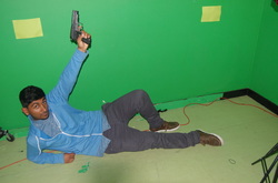
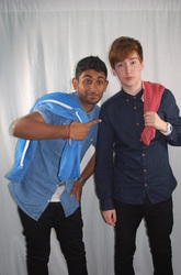
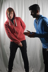
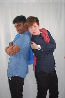
From the selection of photographs above, we had to decide upon which photo we should use for the main image of our magazine. Me and Jai spoke about the pros and cons of many potential images we could use. After a long discussion, we decided to use the 4th image.
This picture displays the actors posing like badasses, with their symbolic hoodies over their shoulders. We decided to use this image because the actors are centered well in the middle of the photoshoot background, the lightly is spot on and the posture of the characters appear comical. However, the only problem with the photograph is that the characters are positioned on the wrong side, instead I should be on the left, and Umesh should be on the right, as done in our poster. But this problem is easily fixed, as the image can be flipped horizontally when editing on Photoshop. The picture looks natural, displaying the actors mocking their film characters. We particularly liked the hoodies over the shoulder, symbolising the characters heroic costume. The hoodies are a significant symbol of our film, so portraying it in our magazine is important, therefore this picture best suits our needs. |
PRODUCTION OF OUR FILM MAGAZINE
STAGE 1
This is the first stage of our film magazine. Firstly, we decided to make the masterhead 'Entertainment Weekly'. We edited the image by changing the colour to dark blue then adding a graphic pen effect to the text. I removed the background using the magic tool. I included the date of release to the poster, positioning it in the top right corner. I also added the main coverline to the
poster, as you can see I am using a colour scheme for the poster, to make it look professional. The main coverline's font is the same font used in the poster, as I am trying to link elements from the poster into the magazine. I also added a subordinate coverline, illustrating the films background. Lastly, I added a puff to the poster, stating that there is an exclusive poster inside the issue, to help sell the magazine. |
STAGE 2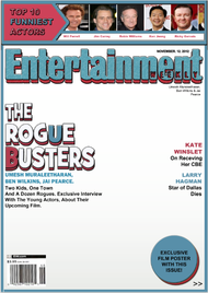
We have completely altered the magazine from the previous stage. I thought that using one colour was too simple, and it wasn't linking to our poster. Therefore I decided to use salmon and blue, which was used in our poster. These colours represent the hoodies Umesh and Ben wear in our trailer. We additionally added a barcode to the magazine, this is a common element of a
magazine. We also added coverlines to the magazine, which refer to the media industry, film stars etc. We changed the puff, adding a duplicate of the puff and making it look 3D. We did this to the main coverline too. The coverline underneath the main coverline, states the main actors names, and then describes the background of the film. Lastly, we added a top 10 funniest actors tab at the top of the magazine, we decided to add this because it refers to the genre of comedy of our film. |
STAGE 3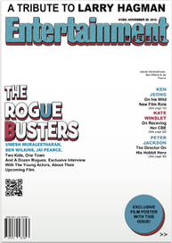
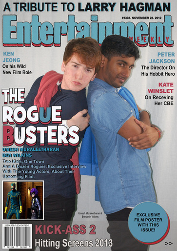
I have removed the 'top ten funniest actors' tab. This was because we felt that it didn't look professional, and spoilt our magazine. The font used in the element was too different compared to the other text used in the coverlines. Instead we included a selling line, stating the death of Larry Hagman, and informing the readers that there is a tribute page in the magazine. This is current media news, and therefore we decided to use this
news headline in our magazine. I additionally added more coverlines on the right side of the magazine, relating to news headlines about the media and film stars. Lastly, I added a QR code, which is used to recieve datapackages, etc. This will be used to recieve a Rogue Buster Wallpaper for the readers phone. This attracts the readers, and promotes our film well. |
STAGE 4
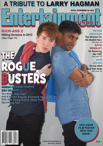
This was the final stage of our film magazine. We added the main image, altering the scale of the image to fit the magazine template. We had to copy the top part of the image, and then remove the background to allow the main image to overlap the masterhead, as this is a common look to the Entertainment Weekly magazine. I also added another coverline, stating Kick-Ass 2. We felt this was relevant, as it has a similar story line to our film. Lastly, we re-positioned some of the coverline to fit well around the main image. We had to duplicate and fill the coverline describing the background of the film black because it clashed with the background colour.
|
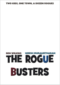
OUR FILM POSTER
|
OUR FILM MAGAZINE
|
