| Benjamin Wilkins - A2 Media Studies |
|
ACTION/COMEDY POSTERS - RESEARCH
We have researched some action/comedy film posters that have a similar storyline to ours. We wanted to research what the common elements of an action/comedy poster are, and what they connote, so we could use them in our own poster. I looked at film posters that obviously display a action/comedy genre film so our research was relevant. Below we deconstructed some action/comedy posters, with similar story lines to our teaser trailer:
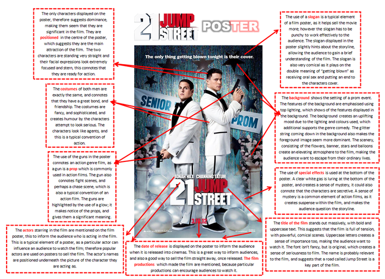
21 JUMP STREET FILM POSTER
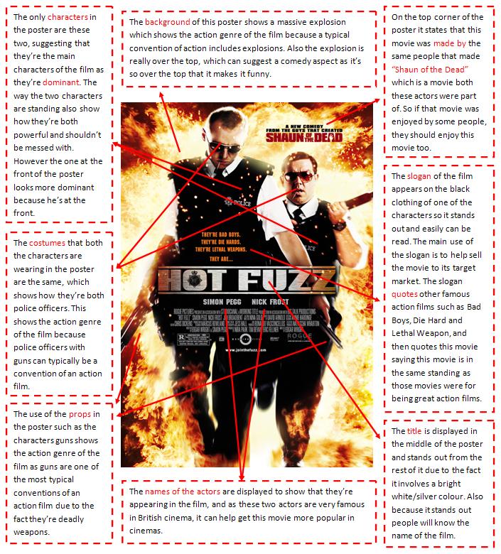
HOT FUZZ FILM POSTER
OTHER SIMILAR POSTERS
HORRIBLE BOSSES POSTER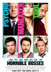
This poster is slightly similar to our story line, this is because there are antagonists and protagonists in our film. We like the idea of displaying the criminals on the top of the poster, and the main characters at the bottom.
|
ANCHORMAN POSTER
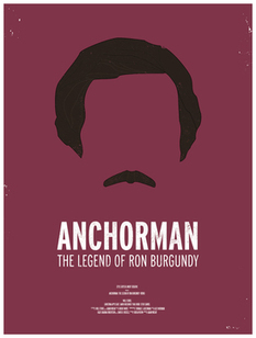
We really like this film poster, its unique and original. The lack of detail is what makes the poster, with only two colours being used. We like the artistic appearance especially. The lack of detail the the face is inspiring, it creates a hidden meaning to the film.
|
HANGOVER II POSTER
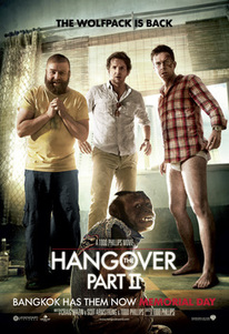
We like the idea of using the main characters as our foreground image, to make them the main attraction of the poster. We also like the comical look to this poster, and we wish to portray this in our poster too.
|
ACTION/COMEDY FILM MAGAZINES - RESEARCH
We have researched some action/comedy film magazines that suit our trailer and storyline. We researched what the common elements of an action/comedy film magazine were, and what they connote, so we could use them in our own magazine. We also research the vital elements that must be used on a magazine, such as a barcode. I looked at film magazines that display an action/comedy genre film appearance so our research was relevant. Below we deconstructed some action/comedy magazines:
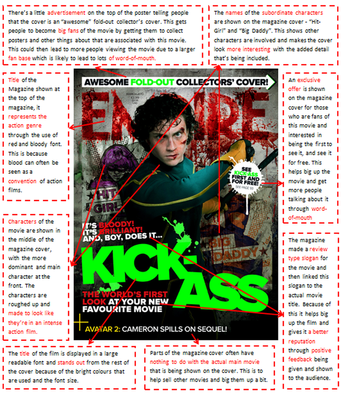
Kick-Ass Magazine Cover
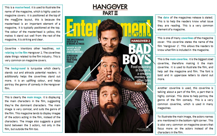
Hangover Magazine Cover
OTHER MAGAZINES
SOCIAL NETWORK
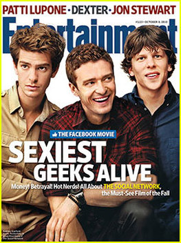
We like the main image used in this poster. The idea of using the main characters, in their costumes is as the main image is a feature we liked. We also liked the colour scheme of the magazine, boyish appearance, which we would like to use in our magazine. In the bottom left hand corner, the names of the actors are stated in small text, we want to do this in ours, as it looks professional.
|
THE AMAZING SPIDERMAN
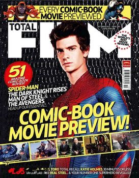
We like the main focus to the action theme in this poster, by using the costume, and the overall appearance of the poster. We especially liked the background, and how we tied up with the story line of the film. The font used in the coverlines is relevant too. The selling line is cool, its a nice way to sell a comic, superhero based film. We like this idea a lot.
|
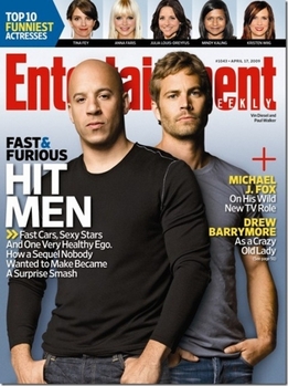
FAST & FURIOUS
Similar to the Hangover magazine, we liked the idea of using the actors on the magazine cover because its a different approach. The main image is also something we like, using the main characters as the main image is an idea were hoping to achieve. Additionally, illustrating the title of the film by a big coverline is also an element from this poster we like. |
